8 tips for better manga pages
Most pages that feel off are not badly drawn. They are hard to read: the eye does not know where to go, every beat gets the same weight, or the turn has nothing to pay off. These eight fixes work at any skill level, and most of them cost nothing if you make them at the rough stage.
1. Thumbnail it first
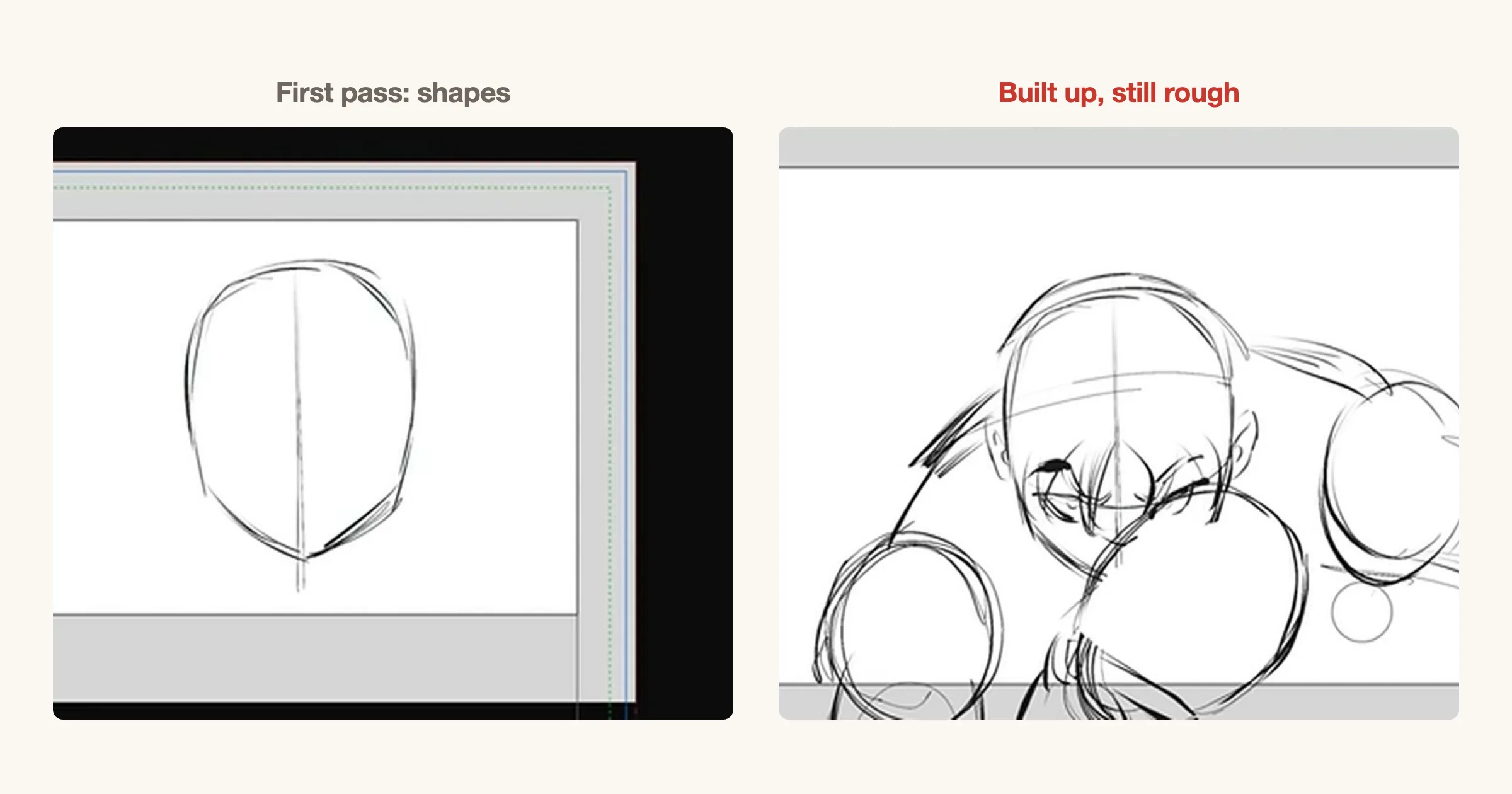
Draw the whole page small and rough before you draw any of it well. At thumbnail size a panel is a box and a figure is a few shapes, so moving a panel or swapping two beats costs seconds. Once a panel is inked, the same change costs an evening, so most artists stop fixing the flow and live with it.
Settle three things at this stage: what each panel shows, how big it is, and where the page ends. If you can read the rough without squinting at detail, the finished page will read too. The storyboard stage, called the name (ネーム), is covered step by step in the manga storyboard guide.
2. Panel size is volume
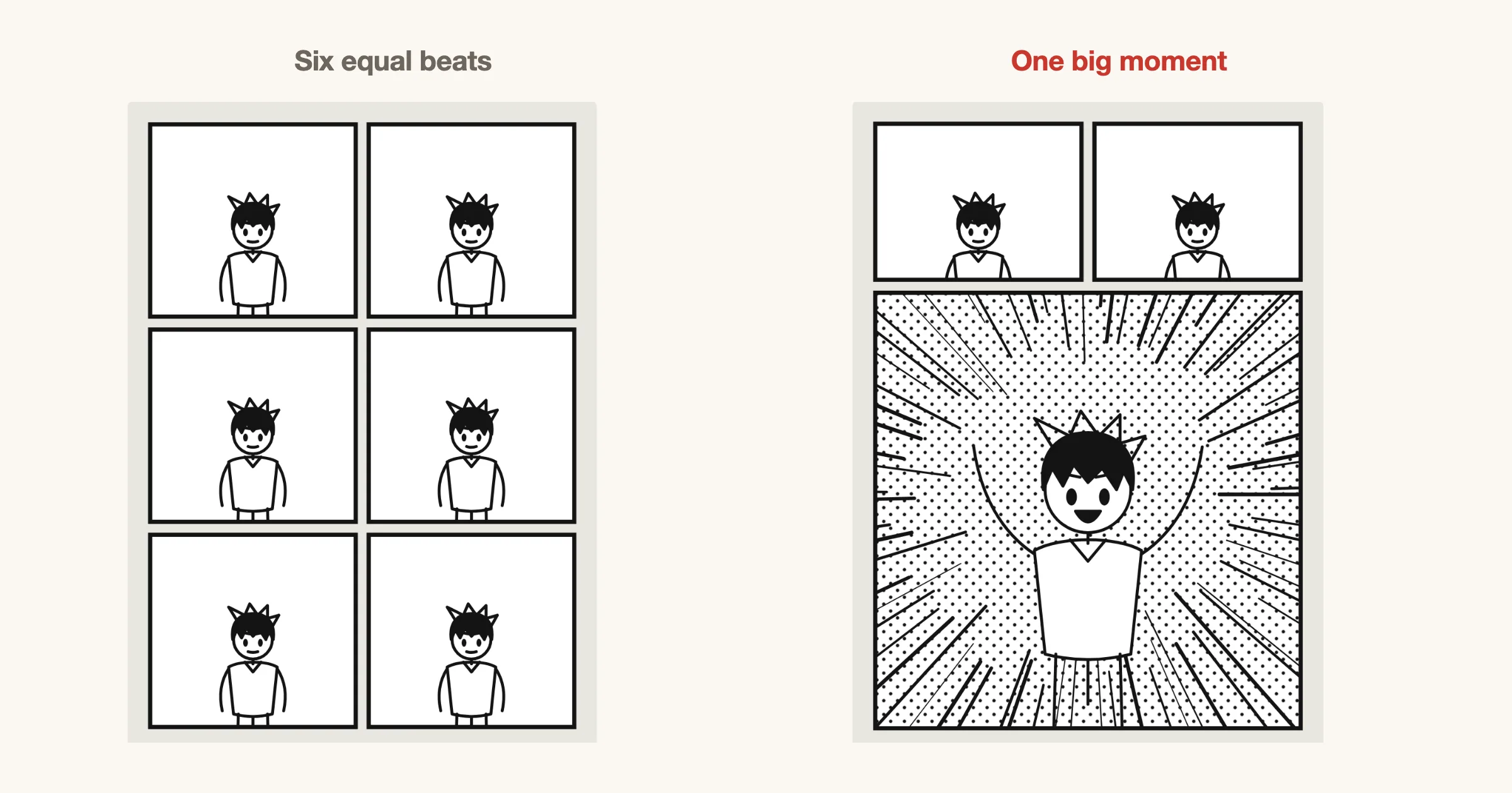
The bigger the panel, the louder the moment. Readers give a large panel more time and more weight, so size is how you tell them what matters. Six equal panels say every beat is as important as every other one, and the page goes flat.
Pick the one beat the page exists for and give it the space. Let the beats leading up to it take small panels, so they read quickly and the big panel arrives with force.
3. Gutters are time
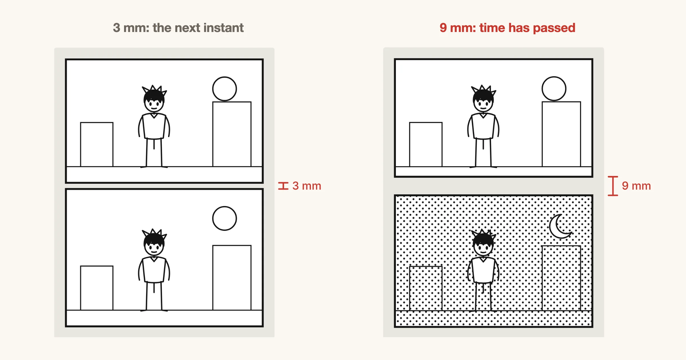
The gutter, the gap between two panels, is where the reader fills in what happened between them. A narrow gutter makes two panels feel like consecutive instants. A wider one reads as a pause, and a much wider one as time passing or a change of place.
Keep one default width for the book, so the variations mean something. A few millimetres is a common default on a print page. Widen it only where you want the reader to feel the gap.
4. Never let gutters cross
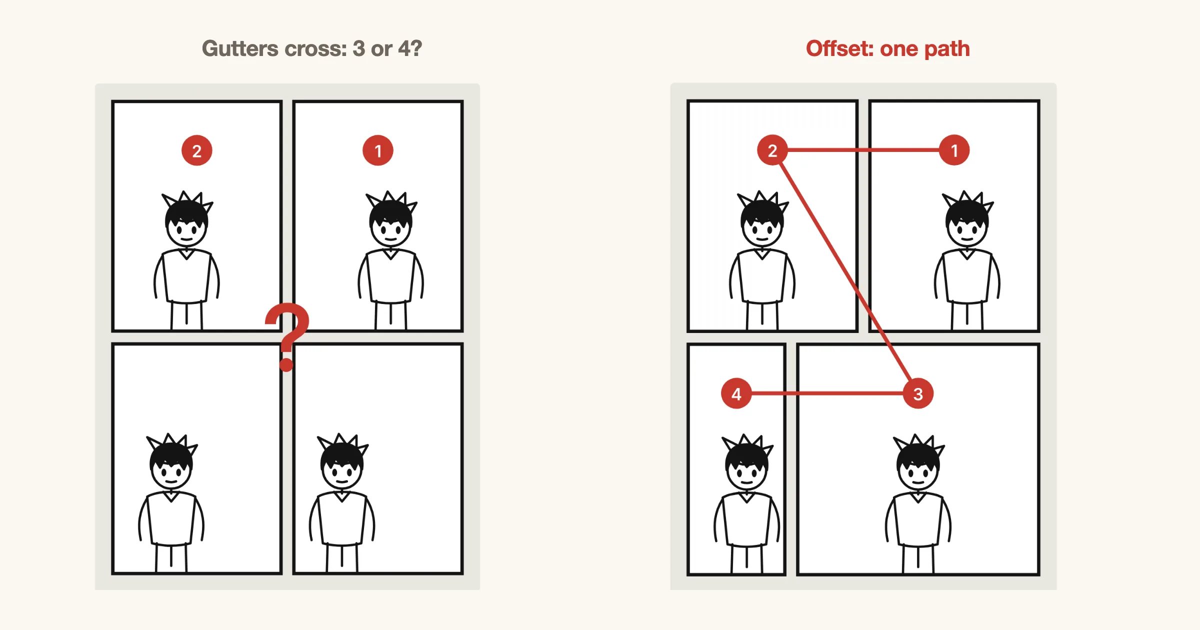
When four panels meet at one point, the gutters form a cross, and after the first row the reader has to guess: across, or down? Some readers will guess wrong, and a wrong guess breaks the scene.
Offset one gutter so no four corners meet. On a right-to-left page, once the lower row’s gutter no longer lines up with the upper row’s, each row reads as its own band and the zigzag through the page is the only path. For more on reading order, see the manga panel layout guide.
5. Move the camera
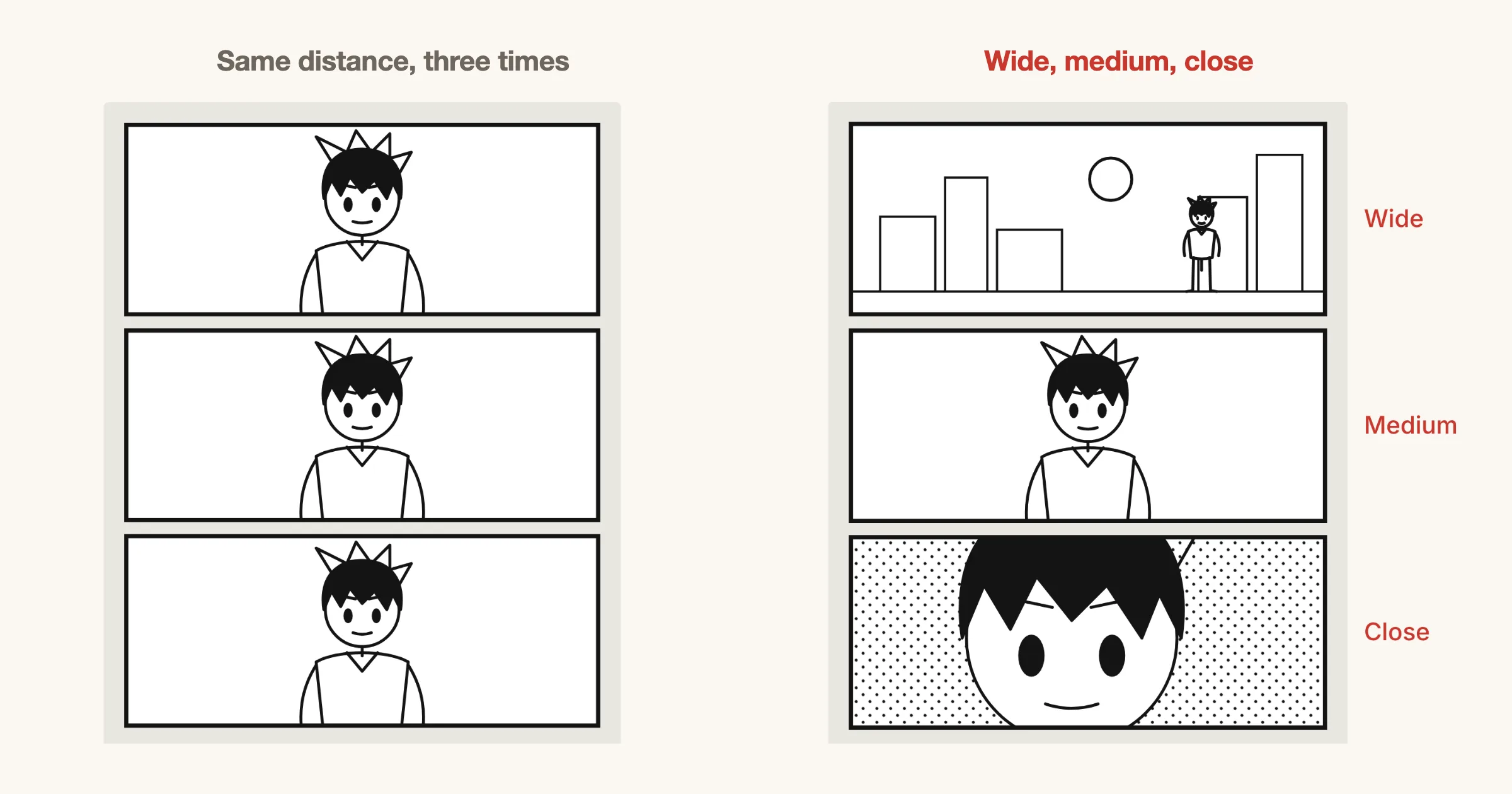
Drawing every panel from the same distance is like filming a scene with a camera bolted to the floor. Each panel is a shot, and changing the distance between shots is what gives a page its rhythm.
A reliable sequence is wide, then medium, then close. The wide shot shows where we are, the medium shot shows who is acting, and the close-up shows how they feel. Cut in when the emotion rises, and pull back when the reader needs to see the space.
6. Put balloons in reading order
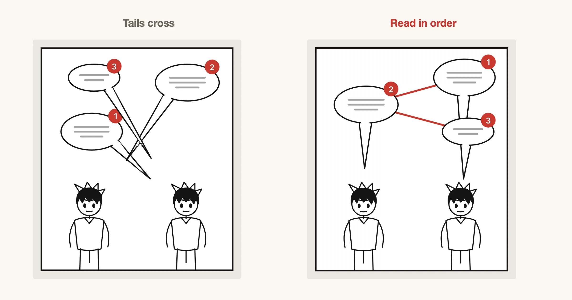
Readers read the words before they look at the art, so balloons steer the eye more than any drawing does. If the balloons are out of order, the reader takes the lines in the wrong order or jumps back, and the conversation stops making sense.
Place the first line top right and work right to left, top to bottom. Keep tails short and pointed at the speaker’s mouth, never crossing each other, and keep balloons off faces and hands.
7. Squint, then place your blacks
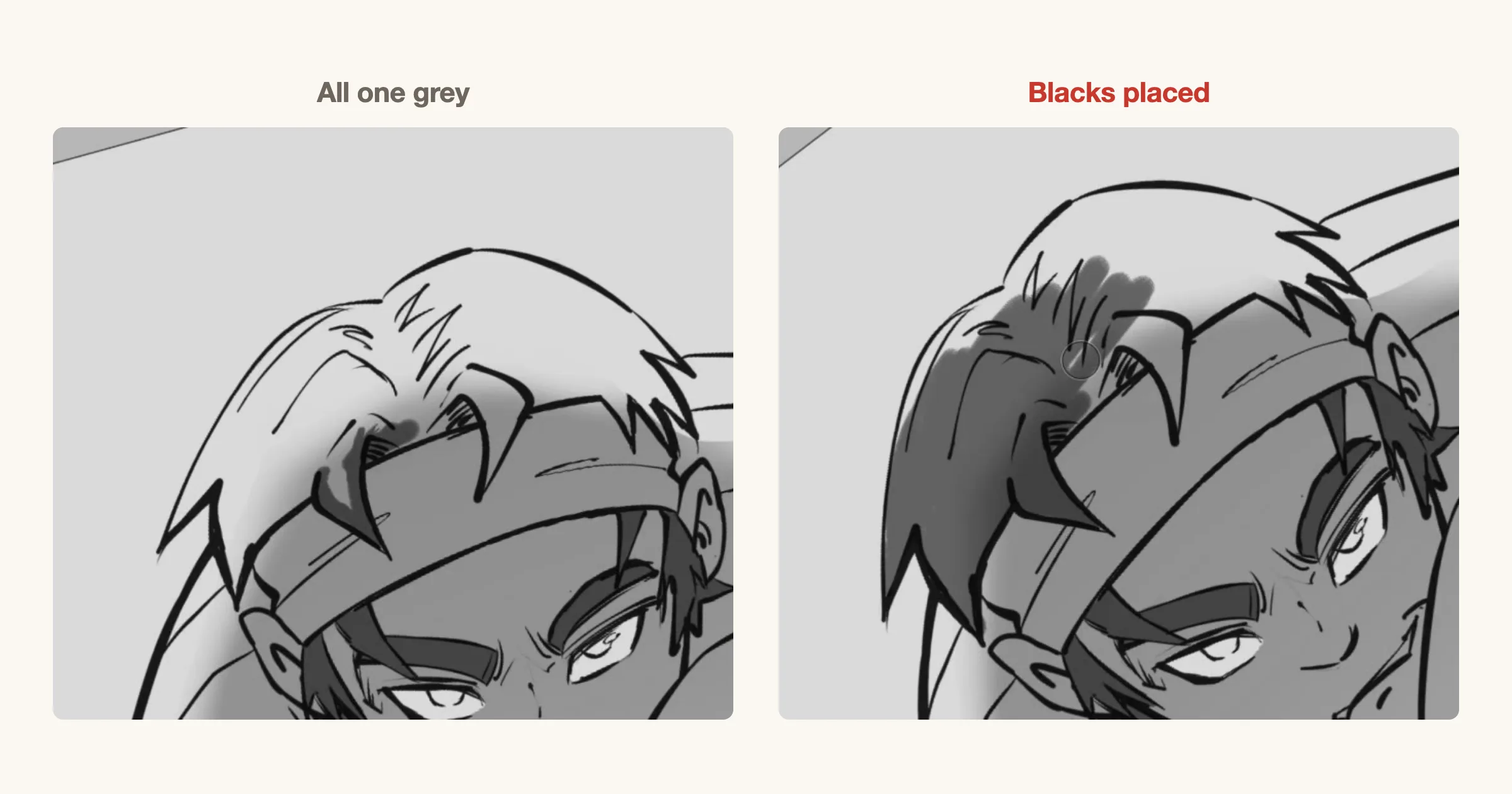
Step back from the page and squint until the detail blurs. If everything turns into the same mid grey, nothing on the page stands out, and the reader has no idea where to look first.
Spot solid blacks on purpose: hair, shadows, a dark coat, the night sky. Use them to separate the figure from the background and to pull the eye to the focal point. Keep screentone for depth and texture, not for filling every empty space.
8. End on a question
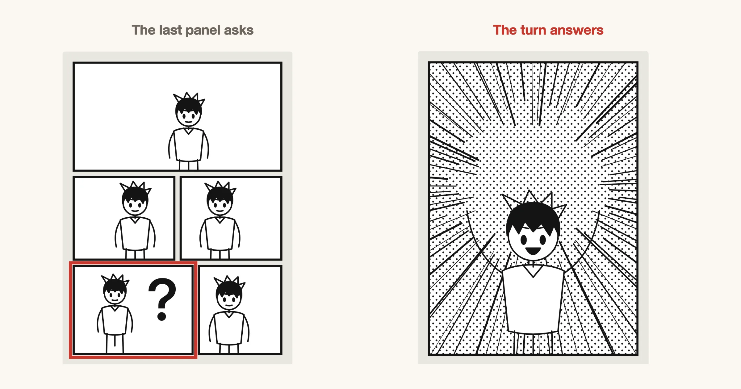
The last panel before a page turn is the one the reader sees right before they turn. Make it ask something: a look off panel, a door opening, a line cut short. The question is what makes them turn the page.
Save the answer for after the turn. In a right-to-left book the turn comes after the left page, so its bottom left panel sets it up and the top of the next page pays it off, all at once, with no chance to see it early.
Check a page in one minute
Before you ink, run the rough through these questions:
- Can you trace the reading path with a finger without hesitating anywhere?
- Is there one panel that is clearly the biggest moment on the page?
- Does every wide gutter mean something, and does no gutter cross another?
- Does the shot distance change at least once?
- Do the balloons read in order, with no crossing tails?
- Squinting, can you still see where to look first?
- Does the last panel give the reader a reason to turn?
Try these in MangaForge
MangaForge is a browser-based manga studio in beta. It does not generate artwork: you draw every page yourself. A few of its tools map directly onto the tips above:
- Storyboard view. Rough the chapter as name before you draw a final page, so the flow is settled while it is cheap to change.
- Panel cuts and gutters in millimetres. Cut panels with the split tool, drag borders to resize them, and set each gutter’s width in millimetres.
- Reading path overlay. Number badges and a reading path show the order the eye will take, so a crossing shows up before a reader finds it.
- Screentone layers. Tone sits on its own layer, so you can try blacks and tones against each other without redrawing the ink.
Frequently asked questions
- What makes a manga page easy to read?
- A clear reading order, panels sized by importance, balloons placed in reading order and a clear focal point in each panel. If a reader never has to stop and work out where to look next, the page is easy to read.
- How many panels should a manga page have?
- There is no fixed number. Many pages hold four to seven panels, but the right count depends on how long the page should take to read. Fewer, larger panels slow the reader down; more, smaller panels speed them up.
- Why should gutters not cross?
- When four panel corners meet at one point, the reader cannot tell whether to read across or down. Offsetting one gutter removes the choice, so the reading order is obvious.
- What does spotting blacks mean?
- Spotting blacks means deciding where solid black areas go on a page, such as hair, shadows and dark clothing. Placed on purpose, they create contrast and lead the eye to the focal point.
MangaForge is in beta. Already have an account? Sign in.