7 tips for manga action scenes that hit
A fight scene rarely feels slow because it is badly drawn. It feels static: the reader cannot place the fighters, the poses stand still, and the big hit is the same size as everything around it. These seven fixes follow one real page, a ping-pong smash by Osman, from the first rough to the final line.
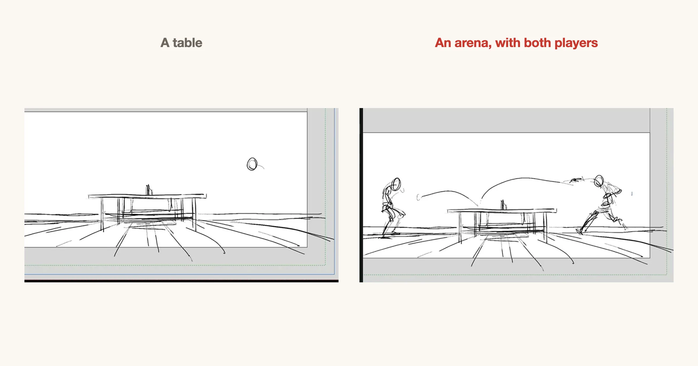
1. Show the arena first
A fight the reader cannot place is a blur of limbs. Before the first hit, give one wide shot that shows where everyone stands and what is between them: the table, the ring, the street. After that the reader can follow every close-up, because they know where it sits.
One wide panel is enough. Return to it when the positions change a lot, for example after someone is knocked across the room.
2. Draw the motion, not the man
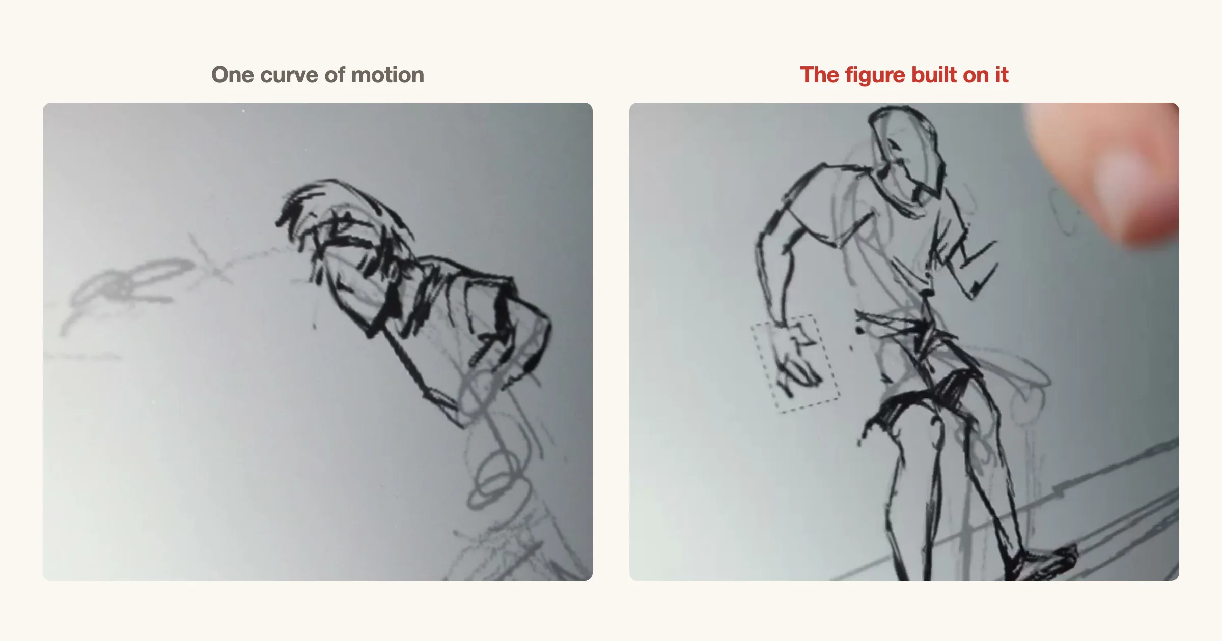
Start each action pose with one curve, the line of action, that runs through the body in the direction it moves. Build the head, torso and limbs on that curve. If you start from anatomy, the figure comes out correct and stiff; if you start from the curve, it comes out moving.
Push the curve further than feels natural. A gentle C reads as standing; a strong C or S reads as effort.
3. Wind up before the hit
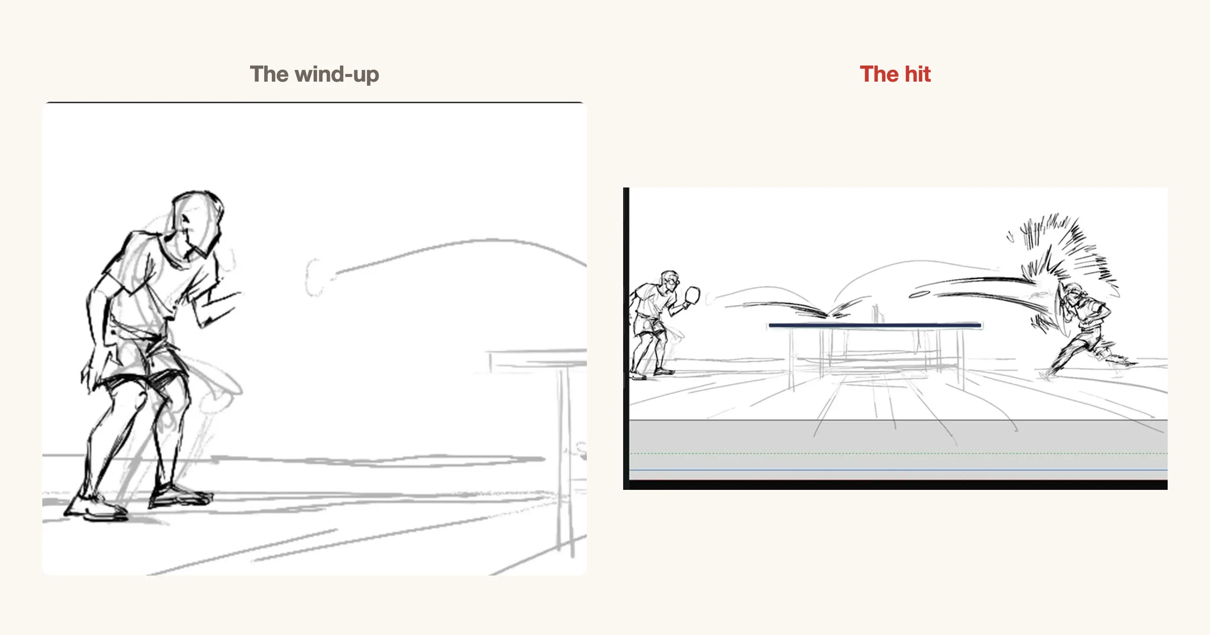
A hit with no wind-up has no weight. Show the moment just before: the crouch, the arm pulled back, the weight on the back foot. That pause tells the reader something is about to happen, and the hit then pays it off.
The wind-up panel can be small and quiet. Its job is to make the reader wait for a beat.
4. Speed lines point where it moves
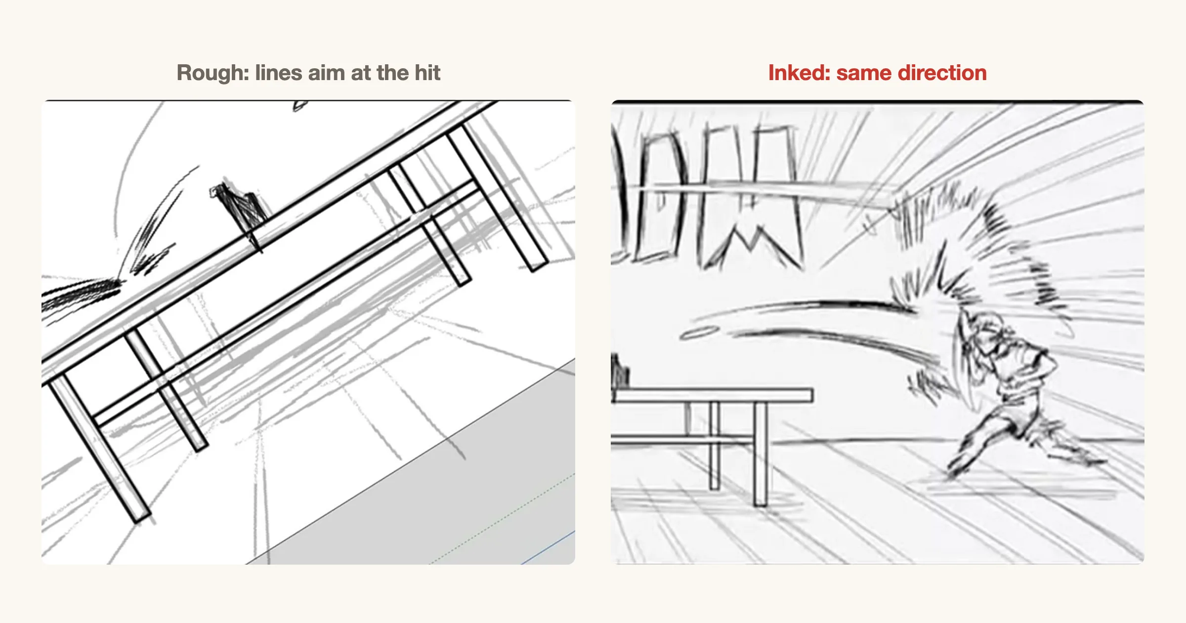
Speed lines are a direction, not a texture. Draw them along the path of the motion, trailing behind what moves, or converging on the point of impact as focus lines. Lines that run in every direction just add noise.
Decide the direction in the rough, so the inked lines and the figure agree.
5. Letter the sound like art
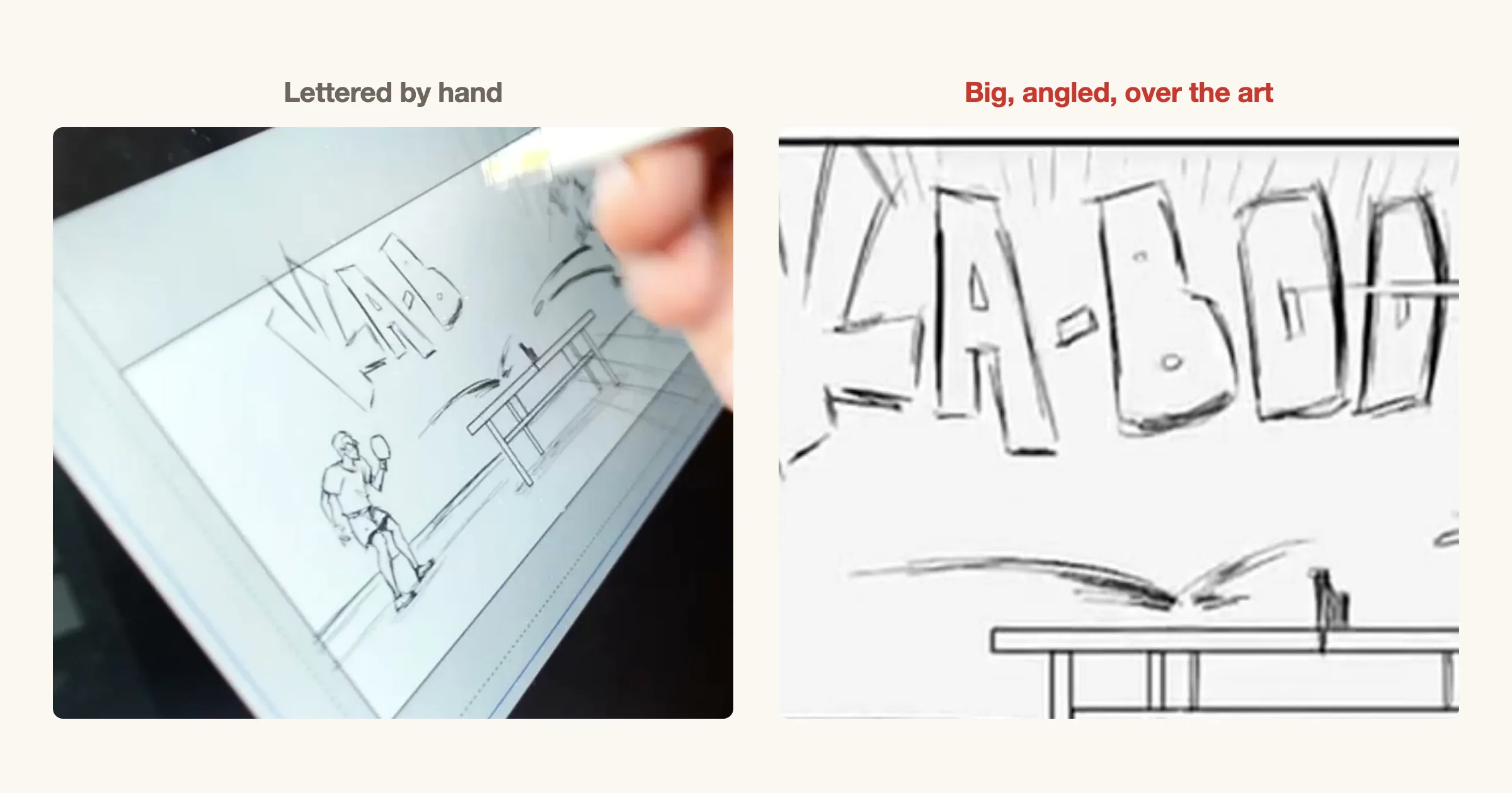
Sound effects are part of the drawing, not a caption. Make them big when the sound is big, angle them along the motion, and let them break the panel border when the impact is too large for the frame. Hand lettering with weight and rough edges reads as louder than clean type.
Place them where they do not hide the action. Behind or around the impact is usually better than on top of a face.
6. Cut to someone watching
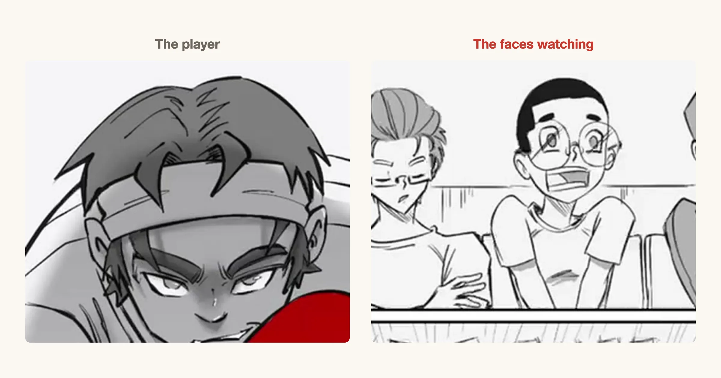
The reader learns how big a moment is from the faces that see it. A row of shocked onlookers tells the reader the shot was impossible without a word of dialogue. It also gives the action a rest beat, so the next hit lands harder.
Draw the reactions with variety: one shocked, one impressed, one who saw it coming.
7. Give the hit the biggest panel
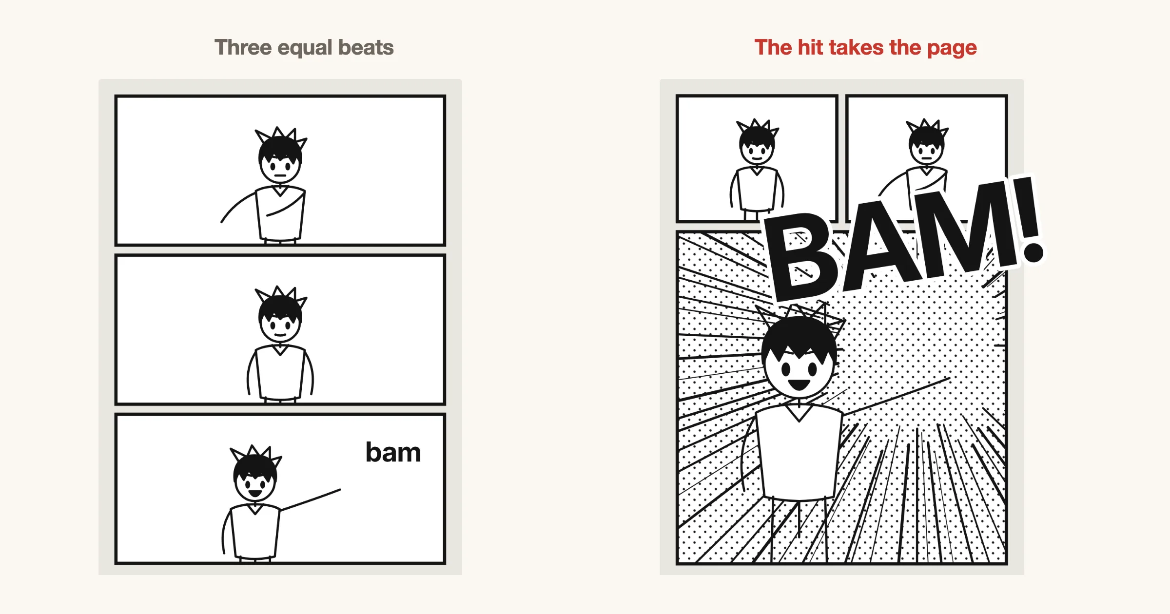
The panel that carries the impact should be the largest on the page. When the wind-up, the swing and the hit are all the same size, the hit is just one beat among three. Shrink the lead-up into small panels so they read quickly, and give the hit the space.
For more on panel size as pacing, see the 8 tips for better manga pages and the manga panel layout guide.
Check an action page in one minute
- Is there a wide shot that shows where everyone stands?
- Does every action pose start from a clear curve of motion?
- Is there a beat of wind-up before the biggest hit?
- Do the speed lines all point the same way?
- Is the sound effect drawn at the size of the sound?
- Does someone react, so the reader knows how big it was?
- Is the hit the largest panel on the page?
Try these in MangaForge
MangaForge is a browser-based manga studio in beta. It does not generate artwork: you draw every page yourself, as Osman did on this one. Rough the page in the storyboard view, cut and resize panels with gutters in millimetres, and ink, letter and tone on layers in the same file.
Frequently asked questions
- How do you make manga action scenes easier to follow?
- Show the space with one wide shot before the fight, keep each panel to one action, and make the reading order obvious. If the reader knows where everyone stands, they can follow quick close-ups.
- What is a line of action?
- A line of action is a single curve through a figure that shows the direction and force of its movement. Drawing it first and building the body on it keeps action poses from looking stiff.
- How should I draw speed lines?
- Draw them along the path of the motion or converging on the impact, all in one direction. Speed lines that point every way read as noise instead of movement.
- Should sound effects be hand lettered?
- Hand lettering usually reads louder and fits the art better than typed text. Size it to the sound, angle it with the motion, and let it overlap the panel border for big impacts.
MangaForge is in beta. Already have an account? Sign in.